
GSA Digital Experience Site Design
- GSA
- 2020
Case Study Overview
Client: U.S. General Services Administration (GSA) - Federal Acquisition Service (FAS)
Platform: Public Website and Authenticated User Dashboard
Timeline: Multi-phase UX modernization
My Role: Senior UI/UX Designer & Front-End Developer
Tools Used: Figma, Adobe XD, Adobe Photoshop, HTML5, CSS3, JavaScript, Angular, Bootstrap, USWDS, WCAG/Section 508 Tools
Project Summary:
The GSA FAS Digital Experience (DX) initiative focused on redesigning how government buyers and vendors interact with federal acquisition tools. The platform supports purchasing, market research, contract tools, historical pricing, IT Schedule 70, and secure user workflows. The goal was to transform a fragmented legacy experience into a modern, intuitive, and accessible digital service ecosystem.
The Challenge
Before the redesign, users faced:
- Complex navigation across multiple acquisition tools
- Inconsistent UI patterns between public tools and authenticated dashboards
- Steep learning curve for first-time government buyers and vendors
- Poor mobile usability
- Accessibility gaps affecting keyboard and assistive technology users
- High cognitive load when navigating procurement workflows
The platform had to serve multiple personas:
- Federal acquisition professionals
- Contracting officers
- Vendors and industry partners
- First-time users unfamiliar with government procurement
The challenge was simplifying an inherently complex federal ecosystem without sacrificing compliance, security, or functionality.
Goals & Objectives
- Simplify federal acquisition workflows
- Improve tool discoverability and navigation
- Create a unified design system across public and private tools
- Ensure full WCAG 2.1 / Section 508 accessibility compliance
- Enhance mobile-first responsiveness
- Improve task efficiency for buyers and vendors
- Provide real-time dashboard visibility for active procurements
UX Research Process
Research Methods Used:
- Stakeholder interviews with contracting officers and program managers
- User journey mapping
- Comparative analysis of legacy GSA tools
- Accessibility audits
- Content usability reviews
Key UX Insights:
- Users needed clearer “Buy vs Sell” pathways
- Terminology caused confusion (acquisition jargon)
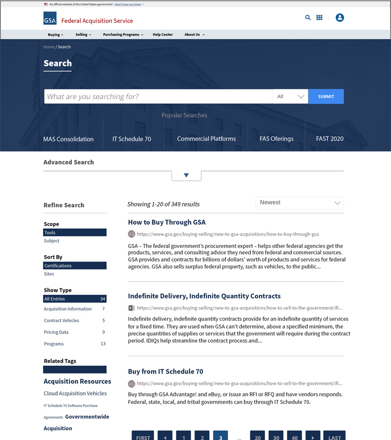
- Search and filtering were critical pain points
- Users wanted centralized access to tools without jumping between systems
These findings drove role-based navigation and task-driven design decisions.
Information Architecture
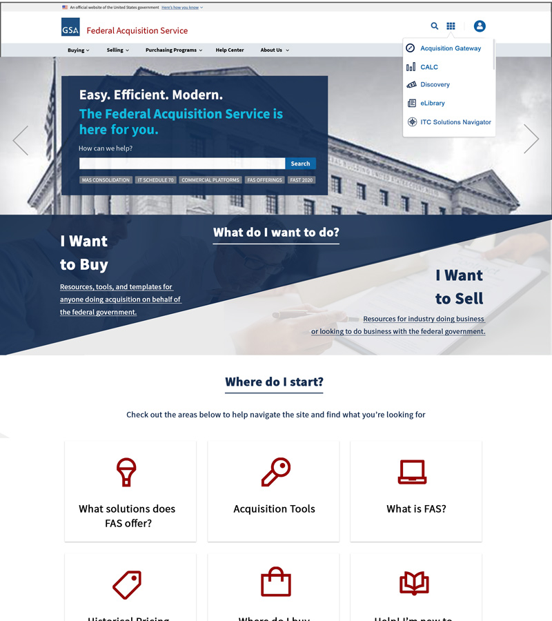
The IA strategy centered on decision-first navigation:
- “I Want to Buy” vs. “I Want to Sell” entry points
- Centralized Acquisition Tools Hub
- “Where Do I Start?” onboarding modules
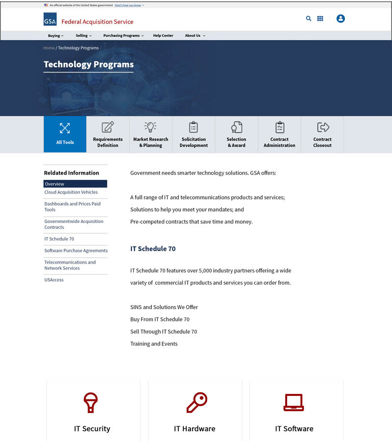
- Tool grouping by lifecycle stage:
- Requirements Definition
- Market Research
- Solicitation
- Award
- Contract Management
- Closeout
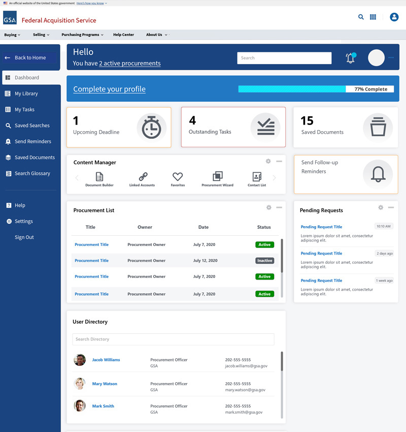
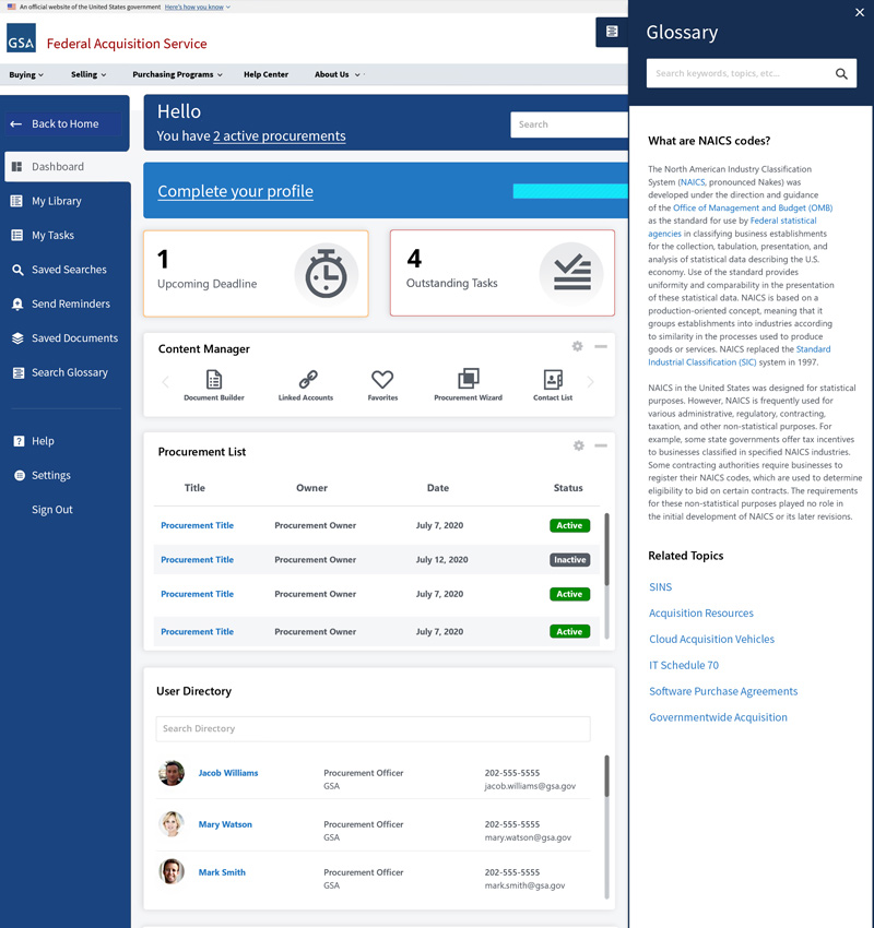
For authenticated users, dashboards organized:
- Active procurements
- Pending tasks
- Saved resources
- User directories
- Follow-up reminders
Wireframes & Ideation
Low and mid-fidelity wireframes explored:
- Homepage search-centric layouts
- Decision-based entry flows
- Modular content card systems
- Tool discovery grids
- Dashboard data visualization layouts
Multiple layout iterations were tested to reduce visual clutter and decision fatigue.
Visual Design & UI System
The visual system emphasized:
- Clean federal branding aligned with GSA standards
- Strong visual hierarchy for critical actions
- High-contrast color system for accessibility
- Consistent iconography for tools and features
- Modular component-based design
- Scalable grid system
The UI system supported:
- Public discovery tools
- Secure, data-heavy dashboards
- Multi-role workflows
Prototypes & Interaction Design
Interactive prototypes were built to validate:
- Global search behavior
- Dashboard task interactions
- Procurement list management
- Notification and reminder flows
- Glossary overlays and contextual help
Micro-interactions were designed to guide users through complex procurement steps without overwhelming them.
Front-End Development
On the development side, I contributed to:
- Responsive UI implementation using HTML5, CSS3, and Bootstrap
- Angular-based dynamic user interfaces
- Component-based dashboard architecture
- Search and filtering UI logic
- Cross-browser and cross-device optimization
- Integration with secure federal APIs
The experience was optimized for:
- Desktop field operations
- Tablet use in government facilities
- Mobile access for on-the-go decision-makers
Accessibility Enhancements (WCAG / Section 508)
Accessibility was built directly into the design system:
- Keyboard-only navigation support
- Proper ARIA landmark roles
- Accessible form labels and validation
- Screen reader-friendly navigation
- High-contrast color compliance
- Focus-state visibility
- Accessible data tables
Accessibility was treated as a core feature, not an afterthought.
Usability Testing
Testing included:
- Moderated task-based testing with contracting officers
- Vendor usability walk-throughs
- Accessibility validation testing
- Iterative design revisions based on feedback
Results showed:
- Faster discovery of acquisition tools
- Reduced time to complete procurement tasks
- Improved confidence for first-time users
Final Solution
The final experience delivered:
- A modern public acquisition gateway
- Unified buying and selling workflows
- A centralized tools-first discovery model
- A fully-featured secure dashboard
- Integrated contextual glossary assistance
- End-to-end responsive behavior
The platform now functions as a single, intelligent acquisition ecosystem.
Impact & Outcomes
- Reduced learning curve for new acquisition users
- Improved tool discoverability
- Faster procurement task completion
- Increased accessibility compliance scores
- Improved engagement across desktop and mobile
- Streamlined workflow visibility for internal users
Lessons Learned
- Federal UX requires merging compliance with simplicity
- Language clarity is as important as visual clarity
- Dashboards must prioritize task urgency, not just data density
- Accessibility must guide design from concept to deployment
My Contribution
- Led UX strategy and interaction design
- Created wireframes and high-fidelity UI designs
- Built responsive front-end components
- Designed dashboard UX workflows
- Implemented accessibility remediation
- Collaborated with federal stakeholders, engineers, and product owners
Final Thoughts
The GSA FAS Digital Experience project demonstrates the ability to simplify some of the most complex digital ecosystems in government. By uniting UX research, accessibility compliance, front-end development, and federal compliance, the platform now delivers a streamlined, secure, and human-centered procurement experience.
This case study reflects my experience in:
- Enterprise UX
- Federal digital modernization
- Dashboard and workflow design
- Accessible front-end architecture